sprite wars, gamers vs evil, and PAX
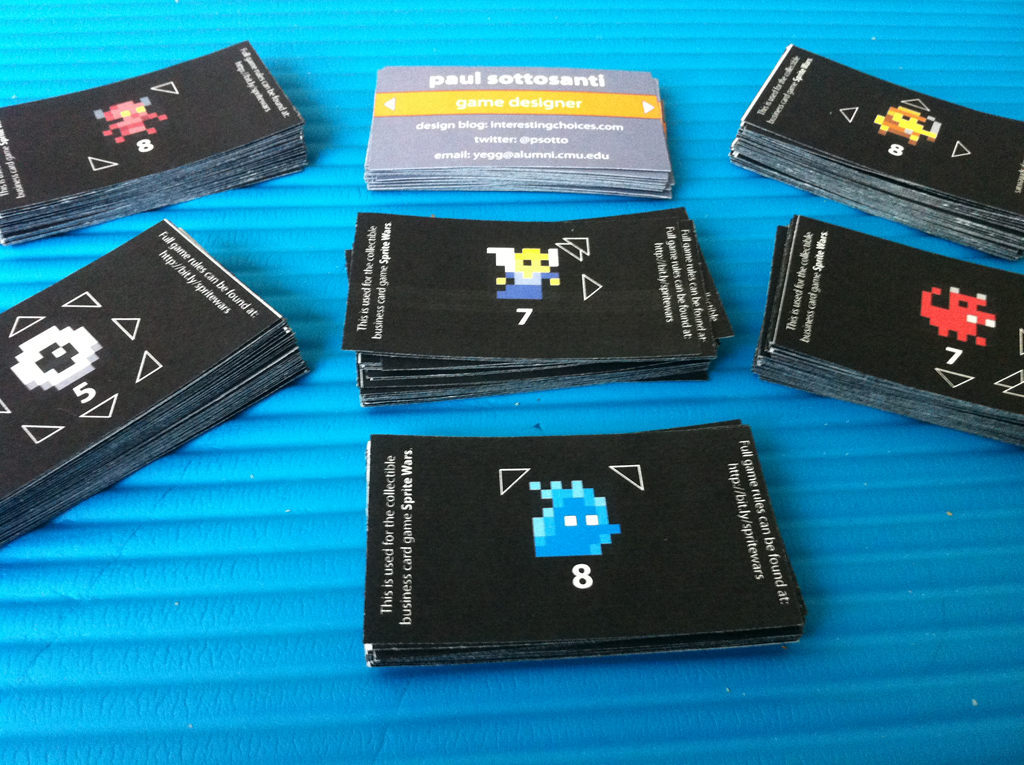
After three ink cartridges, twenty five sheets of perforated business card paper, and a whole lot of work in Illustrator, the business cards are finally done. There are currently 50 unique cards, and I'll be bringing five copies of each to PAX (with the exception of a group of ten that lost one each of their comrades in the process, so those will be a bit rarer than the rest). I'm calling the game Sprite Wars, and the rules set is a fairly simple modification of Tic-Tac-Toe.
You're probably raising one eyebrow and muttering something like, "Interesting..." right about now. Why Tic-Tac-Toe, a game that no adult in their right mind plays with each other, that is solved and always results in a draw? Well, I had a few goals in mind for the game:
- Players should be able to learn it very quickly, ideally from just watching someone play.
- It should be playable in only a couple of minutes.
- It should only require a few cards per player.
- It can't require any sort of additional materials and should be playable on pretty much any small flat surface.
These are wildly different goals from most TCGs that you would find in your local store. Whenever I'm trying to make something that people can pick up extremely quickly, I find it makes a lot of sense to start from a game that everyone is familiar with and innovate from there. In this case, the image of little pixel characters surrounded by arrows pretty much instantly popped into my mind, which took me in the direction of using the rules and victory condition of Tic-Tac-Toe.
Those who follow me on Twitter might have seen me agonizing over the design of the front of the cards. I wanted something to ensure that people looking at the front would notice the back, ideally in an organic manner so that I wouldn't have to keep repeating "and look at the back too!" to everyone. Originally I had small text at the bottom saying "flip me over!", but it made the card feel cramped and I had to squeeze multiple things on one line. After a bunch of advice I ended up just going with some simple arrows on the sides; they don't explicitly tell anyone to turn over the card, but they hint at it and they nicely reference the arrows on the back that drive the gameplay.
That said, I now regret adding them. What I didn't realize is that I was going to have some issues with getting the printing to line up, especially on the fronts (which I printed second, regrettably after waiting a few days, giving the ink-laden paper time to warp). Without the arrows, small differences in alignment wouldn't have been noticeable. With them, it's sadly obvious, and worse, it "marks" the cards for the game because savvy players will be able to remember the arrow placement on their different cards and know what they're about to draw. Then again, this is just a free game on the back of my business cards, so it's really not that big of a deal, but it's a good lesson for the future.
All told it probably cost around $60 or $70 in ink and paper for 240 cards, which seems like a lot, but for full color, double sided cards with 50 different unique designs, I'm pretty happy with how it turned out. I'll be giving them out at PAX this weekend, so if you're there, say hi! I'll be a part of two talks at PAX Dev: Practical Systems Design in the Context of Darkspore (scintillating title I know) and Design Doc Do's and Don'ts, where I'll be talking about everything but traditional design docs. At PAX itself I'll be spending a lot of time at the SpyParty booth, or perhaps at the Cryptozoic booth as well, where they'll have some early copies of The Penny Arcade Game: Gamers Vs Evil, a game that I designed along with some help from Mike Donais and Matt Place.
It's firmly in the deckbuilding genre, and takes inspiration from games like Dominion and Thunderstone, but also adds its own twist to things with mechanics like facedown unique boss loot and player avatars that grant a special ability and determine the composition of your starting deck. I've been a huge fan of Penny Arcade for as long as I can remember, so it was a huge honor to design this game for them. Can't wait for people to get a chance to try it out!


August 21st, 2011 - 12:40
Want!!!
Hope I get to see your talk at some point too. Know you’ve been thinking about it for a long time.